I often need to code some way to have multiple pages rendered in the same location : think about a configuration panel with several sub panels. The natural way to code this is using tabs.
In this tutorial, I’ll use Svelte to code a simple application showing two tabs that can be easily extended to manage more tabs.
As usual, let’s start a new Svelte project using Esbuild, by following my previous post Set up a Svelte project using ESBuild
You can also follow along on my GitHub page or on this Svelte Repl.
The file “app.svelte” will have all the logic to manage the tabs.
We will add 2 more files to showcase the tabs :
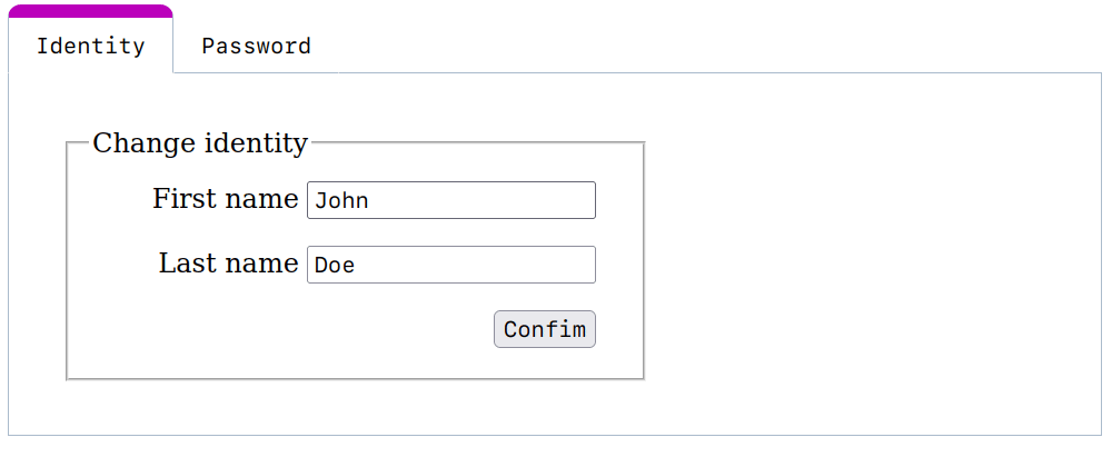
- t_identity.svelte : the main tab (showed by default)
- t_password.svelte : another tab that will reuse our
password chooserfrom my last post Tutorial : Password Creation in Svelte
The content of these two files is not relevant for this tutorial. Our main focus will be on the app.svelte file :
 1<script>
 2	import Identity from "./t_identity.svelte";
 3	import Password from "./t_password.svelte";
 4
 5	let tabs = [
 6		{ name: "Identity", comp: Identity },
 7		{ name: "Password", comp: Password },
 8	];
 9
10	let cur = tabs[0];
11</script>
We begin the script section by importing our two tabs : Identity and Password.
Then we add them to an array tabs. We use a simple object with one field for the name and one field for storing the component. So if we want to add more tabs, we only need to import the component and add it to the array tabs.
Lastly, we declare a cur variable to store the current tab selected : by default, we’ll use the first one in the array. So cur will contain an object with the name of tab and the component to show.
OK, that’s all for the JavaScript part, let’s see the HTML part :
1{#each tabs as tab}
2	<button class:selected={cur === tab} on:click={() => (cur = tab)}>
3		{tab.name}
4	</button>
5{/each}
6
7<main>
8	<svelte:component this={cur.comp} />
9</main>
We construct the tabs as buttons with a #each loop, iterating on the array tabs declared above :
class:selected={cur === tab}will affect the classselectedto this button if it is the current tab (cur), so we can stylize the selected tab.on:click={() => (cur = tab)}will react to a click on the button by changing the current selected tab.{tab.name}will be the name inside the button.
The important code is in the main section with the svelte:component directive.
This Svelte directive can render any component we give it. We use the fact that we stored the current tab in the cur variable, precisely, the component is in the comp field of our simple object.
So <svelte:component this={cur.comp} /> will render the tab at this location.
And that’s it ! We have now a way to manage tabs with Svelte, the rest is just some CSS styling. All source code is available on GitHub.